Skillsoft: Web Interaction Builder
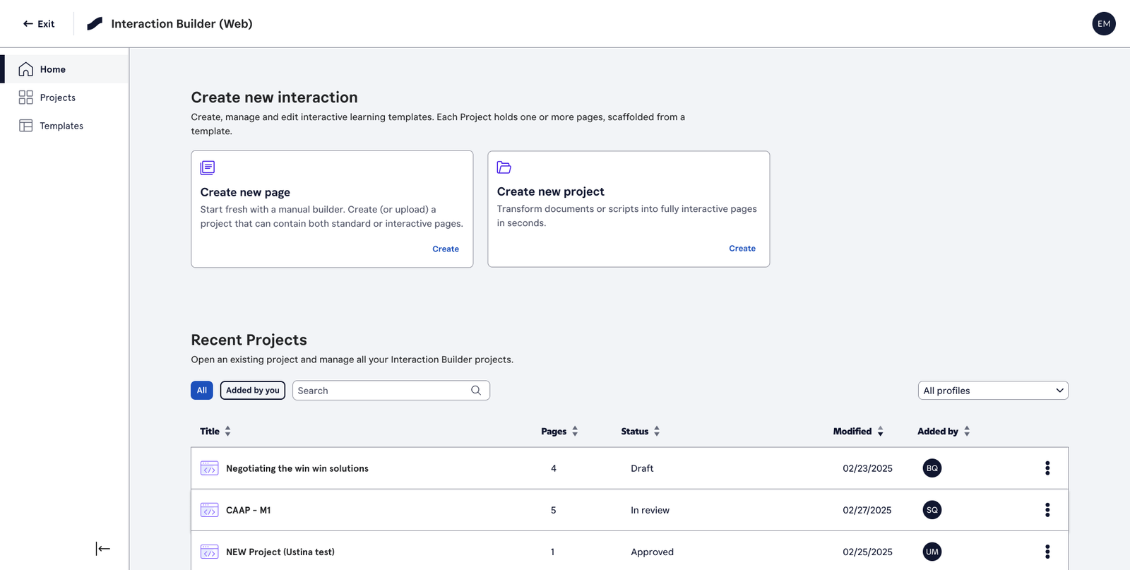
Skillsoft needed to evolve a business-critical authoring tool from a standalone desktop application into a platform capability that could support a growing ecosystem of content creation products and external customers.
Overview
Role: Lead Product Designer (internal teams)
Timeline: Q2 2026
Tools: Research, Figma, Skillsoft design system, cross-functional collaboration with Course Designer UX lead
Deliverables: End-to-end UX flows for MVP (Q2 2026), covering 5 personas, 5 user flows, and a universal editor across standalone and embedded modes
The Challenge & The Solution
The Problem: Skillsoft’s Interaction Builder is a desktop authoring tool used daily to create interactive learning content. While powerful and widely adopted, it was built for a different era of content production.
The tool was limited to Windows, disconnected from the wider content ecosystem, and unable to support the growing suite of browser-based authoring products. As Skillsoft expanded its platform and customer base, the experience needed to evolve without disrupting the workflows that thousands of users relied on every day.
My challenge was to redesign the Interaction Builder for the web – preserving the speed and flexibility experienced users expected while creating a more accessible, connected, and scalable authoring experience for both internal teams and external customers.
The Discovery & Constraints
Understanding the existing tool first. Before redesigning anything, I needed to deeply understand what content developers, writers, and designers were doing in Windows IB every day — what workflows they relied on, where the friction was, and what couldn’t change.
Key findings that shaped the design:
- Five distinct personas use the tool in very different ways: Content Developers (the primary users), Writers/Instructional Designers, Designers, Content Production Teams, and — new with this project — External LXDS customers building courses for their own organisations
- Terminology mattered. Early stakeholder sessions surfaced misalignment around naming — “projects” vs “modules” vs “pages.” Getting this aligned early prevented downstream confusion across teams
- Round-trip compatibility was a hard requirement. Windows IB wouldn’t disappear overnight. Web IB needed to import from and export back to the desktop tool, protecting in-flight work for teams mid-migration
- Embedded and standalone had to feel the same. Whether a user opened the editor from the dashboard or from inside Courses 2.0, the experience from the editor pane inward needed to be identical code and identical feel
Defining the Flows
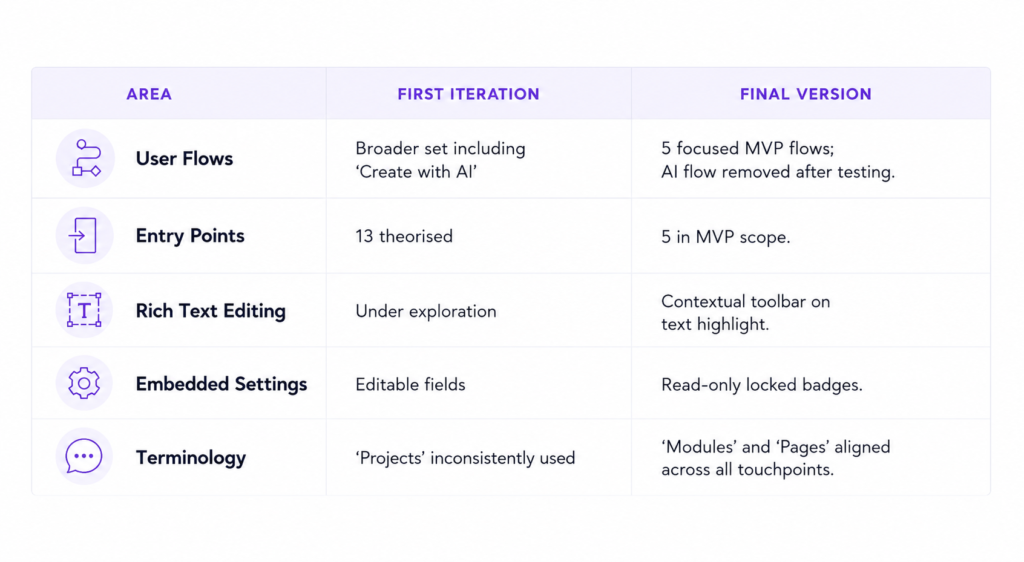
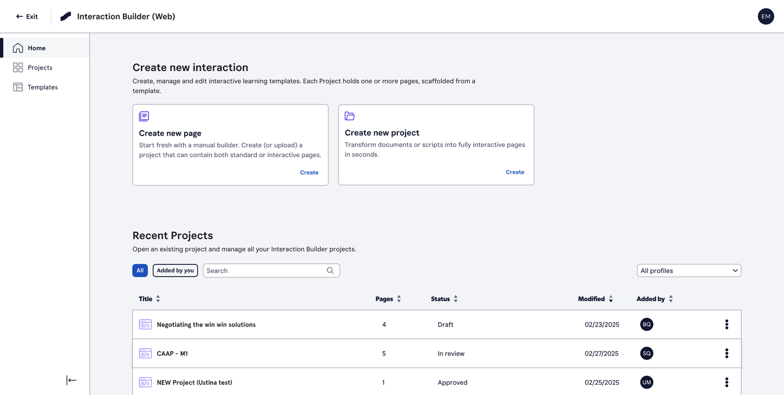
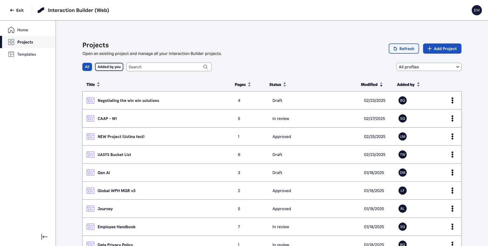
The first iteration explored a broader set of entry points and journeys. After usability testing and scope refinement, the MVP landed on 5 flows covering the most critical paths for the target personas.
The 5 MVP flows:
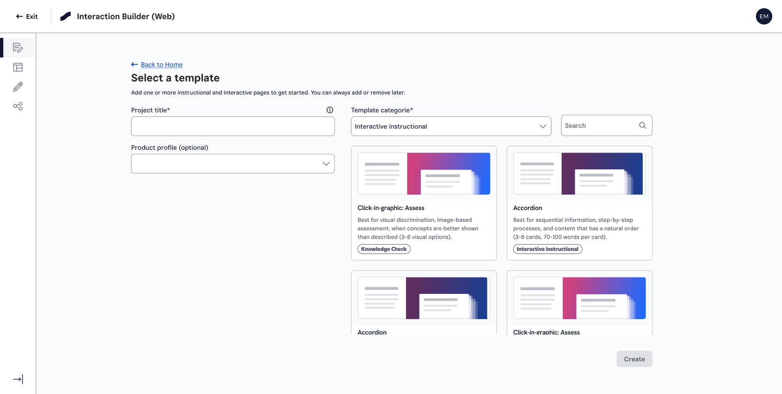
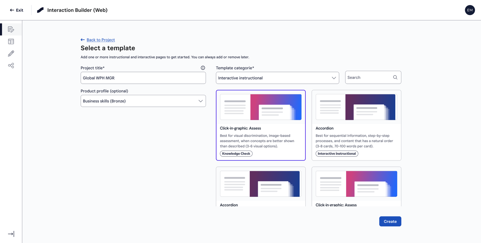
- New page (standalone) — User opens Web IB, creates a new page, picks a template from the gallery, names the project and product profile, and enters the universal editor. The closest equivalent to the existing Windows IB workflow.
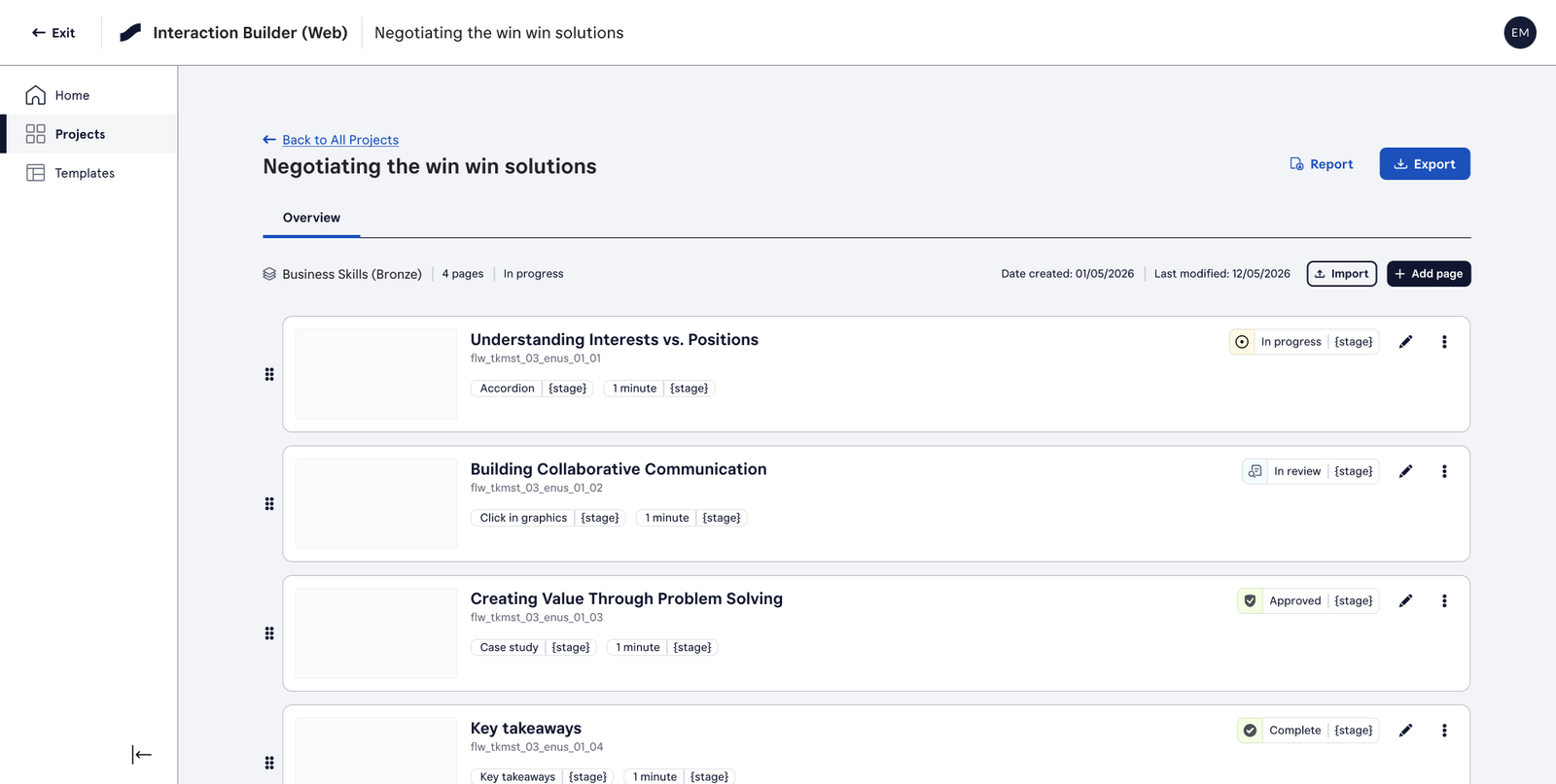
- New project — User creates a project (a named container), then adds or imports pages into it. Supports rearranging and managing multiple pages within a workspace.
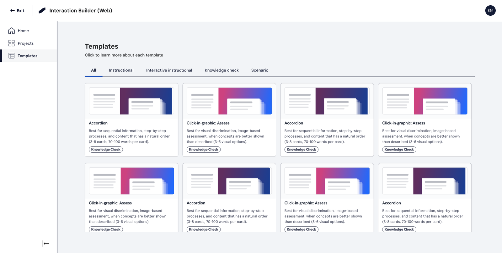
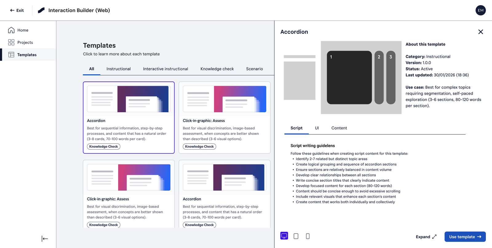
- Template page — User arrives at the template gallery directly (e.g. from the left nav), browses or filters templates, and either creates a new project or adds a template to an existing one.
- Embedded create new in Courses 2.0 — Web IB loads inside Courses 2.0 as a frame. Course context (topic, profile, language, brand) is inherited automatically. Settings appear as locked badges rather than editable fields. On save, the interactive is placed at the topic.
- Embedded edit existing in Courses 2.0 — An existing course-bound page opens for editing. Template is fixed; content is pre-loaded. If the page’s template version is older than what Template Manager holds, a silent upgrade runs. The author edits content; the course owns the context.
What We Chose Not to Build
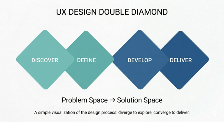
The initial concept included AI-assisted content creation and a broader set of entry points. These ideas generated interest but introduced complexity that did not support the MVP goals. We removed them to focus on the highest-value authoring workflows.
Key Design Decisions
1. One editor, two shells
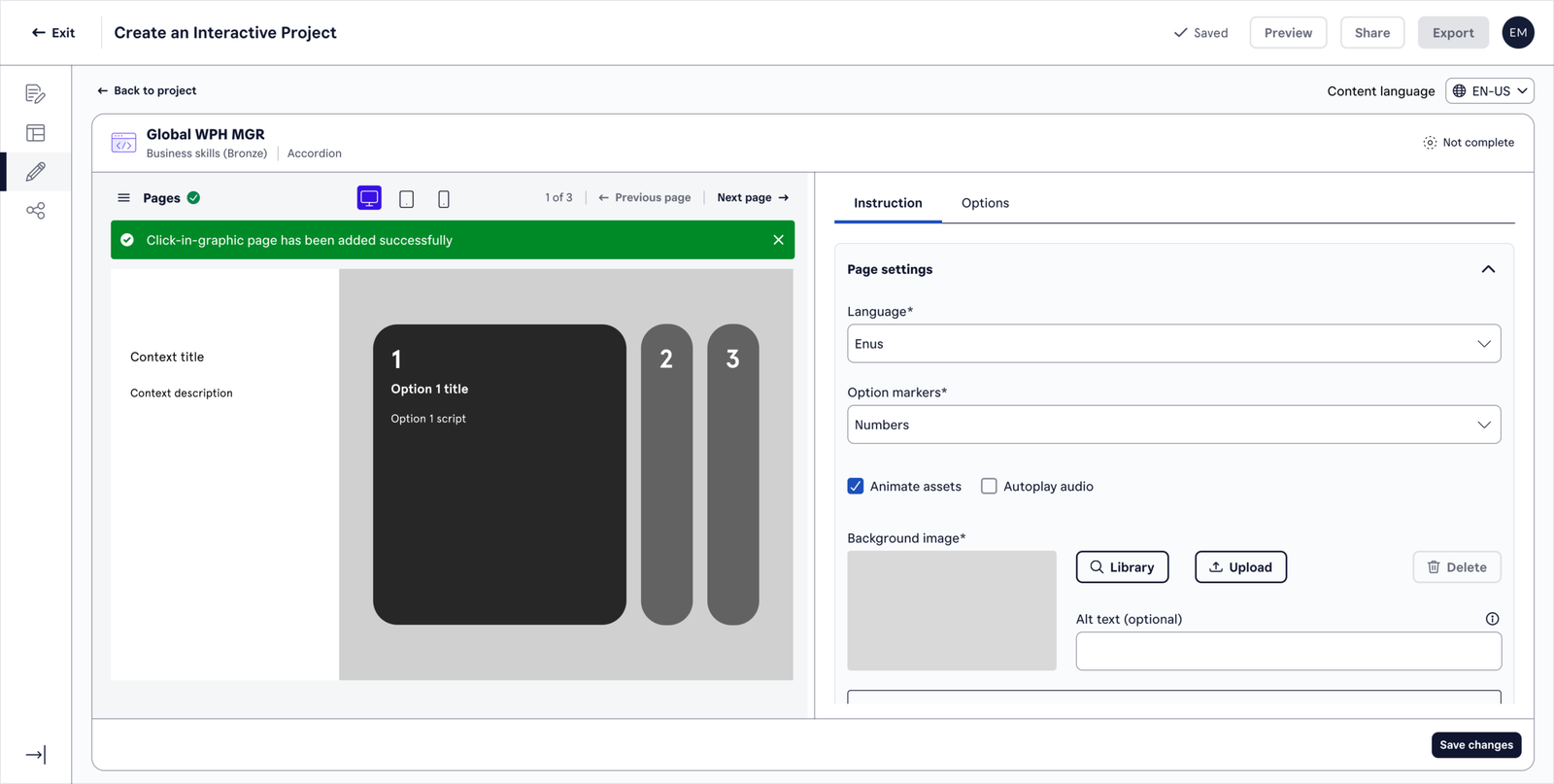
The most important structural decision of the project: the editing experience had to be identical whether a user was in standalone mode or embedded inside Courses 2.0.
This wasn’t just a technical constraint — it was a UX principle. Users should never feel like they’re in a different tool depending on where they entered from. The three-pane layout (Settings | Content | Live Preview) is the constant. The shell — Dashboard chrome in standalone, iframe in embedded — changes. Everything inside stays the same.
This required sustained collaboration with the Course Designer UX lead to align on shared patterns, shared component language, and exactly where each product’s responsibility ended.
2. Rich text editing without a library component
The Skillsoft design system didn’t have a rich text editor component. Rather than block progress or pull in an external library, I designed a contextual toolbar that appears when a user highlights text — giving access to formatting controls inline without adding persistent UI to the content pane.
This kept the interface clean, matched behaviour users expect from modern web editors, and avoided a dependency on a component that didn’t yet exist in the system.
3. Settings as locked context in embedded mode
When Web IB runs inside Courses 2.0, settings like language, product line, and brand are already determined by the course. Showing them as editable fields would be misleading — and changing them would break the course’s consistency.
The solution: in embedded mode, settings become read-only badges rather than form controls. The author sees the context they’re working in, clearly, without being invited to change it.
4. Page lifecycle as a first-class concept
The Web IB introduces a formal eight-state page lifecycle — Draft, In Review, Revision Required, Approved, Packaged, Published, Archived, Retired — replacing the informal save/export pattern of the desktop tool. Packaged versions are immutable; further edits spawn a new Draft.
This was a significant conceptual shift for users accustomed to file-based workflows, and required careful UX treatment to make the states legible, non-blocking, and clearly distinct from the course-level states inherited from LXDS.
What Changed Between Iterations
Through stakeholder reviews, workflow mapping, and concept validation, several assumptions were challenged, resulting in a more focused MVP.
Key Outcomes
Defined the MVP experience for five user groups.
Established a scalable foundation for browser-based authoring.
Created a universal editor model across standalone and embedded contexts.
Aligned terminology and workflows across the Skillsoft content ecosystem.
The Universal Editor
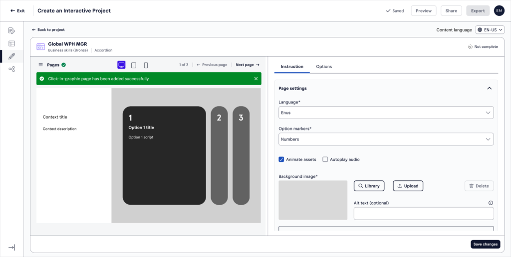
The editor is built around three panes:
- Settings — template, language, product line, theme, audio autoplay, lifecycle state. Editable in standalone; read-only badges in embedded mode.
- Content — per-template form fields. Auto-save fires within 5 seconds of idle. Undo/redo persists across saves.
- Live preview — updates within 500ms of any edit, no save required. Renders actual template CSS and JavaScript — what the author sees is exactly what learners see, across 4 breakpoints.
Final prototype (MVP)
Reflection
The hardest part of this project wasn’t the complexity of the flows — it was the discipline of knowing what to cut. The “Create with AI” flow felt like a compelling idea on paper. Watching users interact with it made clear that a good idea at the wrong moment in a product’s maturity is still the wrong idea.
Designing at the seam between two products — where a user moves from Course Designer into Web IB without noticing the transition — required constant alignment and a willingness to let go of product boundaries in service of the user experience. That collaboration with the Course Designer UX lead was one of the most valuable parts of the process.
What I’d do next: I’d want to instrument the 5 entry points and understand where users lose confidence — particularly in the embedded flows where context is inherited rather than chosen. I’d also want to revisit the page lifecycle with real users post-launch. It’s a conceptual leap from file-based working, and the friction there likely only shows up at scale.