To meet diverse learning needs, I implemented four distinct Template Sequences (A, B, C, D). My role was to ensure that regardless of the sequence chosen, the user experience remained intuitive and the visual hierarchy stayed intact.
- Sequence A & B: Focused on “Why” vs. “Practice First” approaches.
- Sequence C & D: Designed for “Deep Mastery” vs. “Direct Application.”
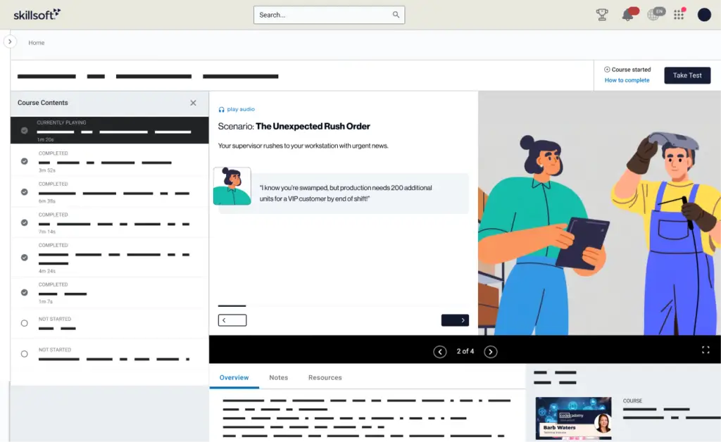
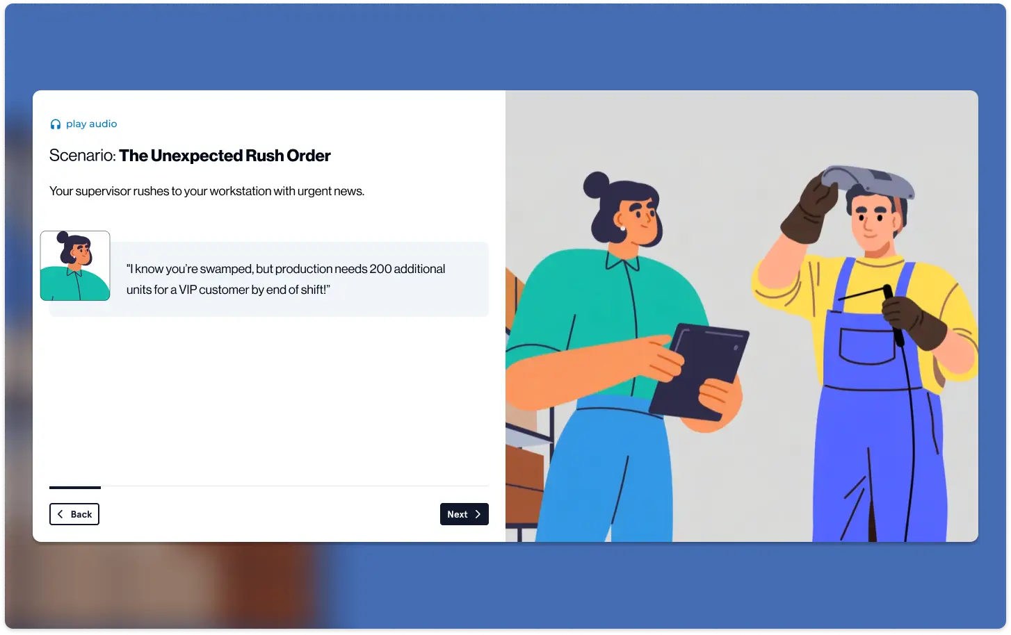
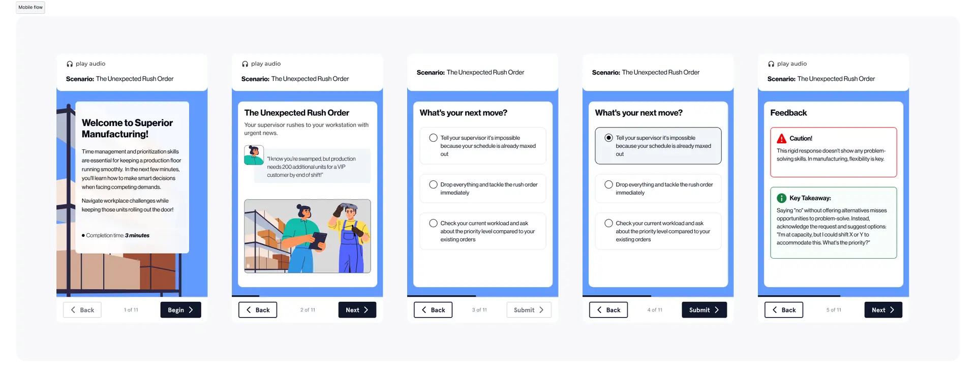
The Execution: The 7-Screen Blueprint
I designed a standardized flow that guides the learner from an emotional “hook” to a practical “takeaway” in under 10 minutes:
- The Hook: Clickable cards surfacing real workplace obstacles.
- The Big Idea: Bridging the obstacle to a skill-based solution.
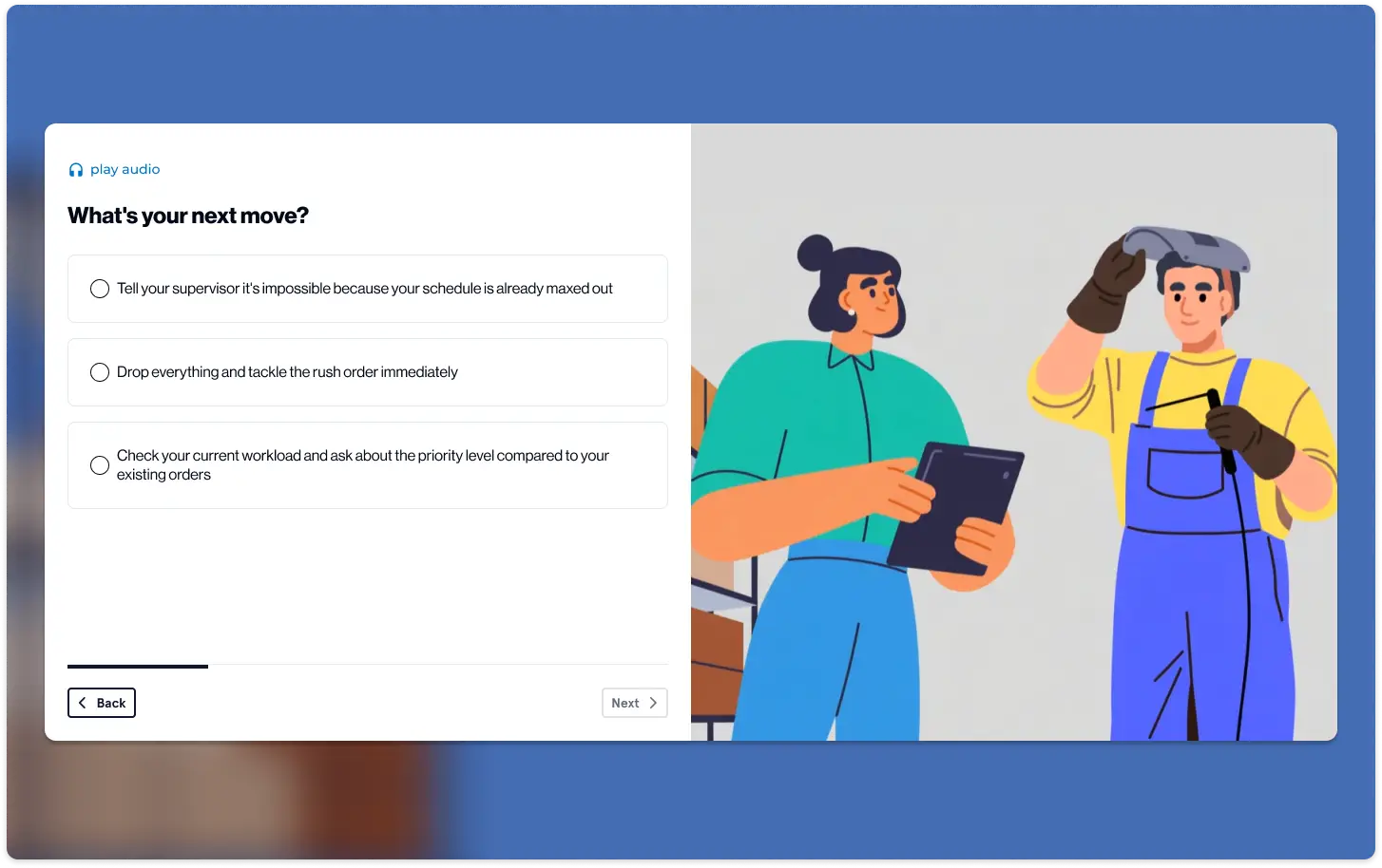
- Skill Breakdown: “The How” and “The Benefit” delivered via interactive popups.
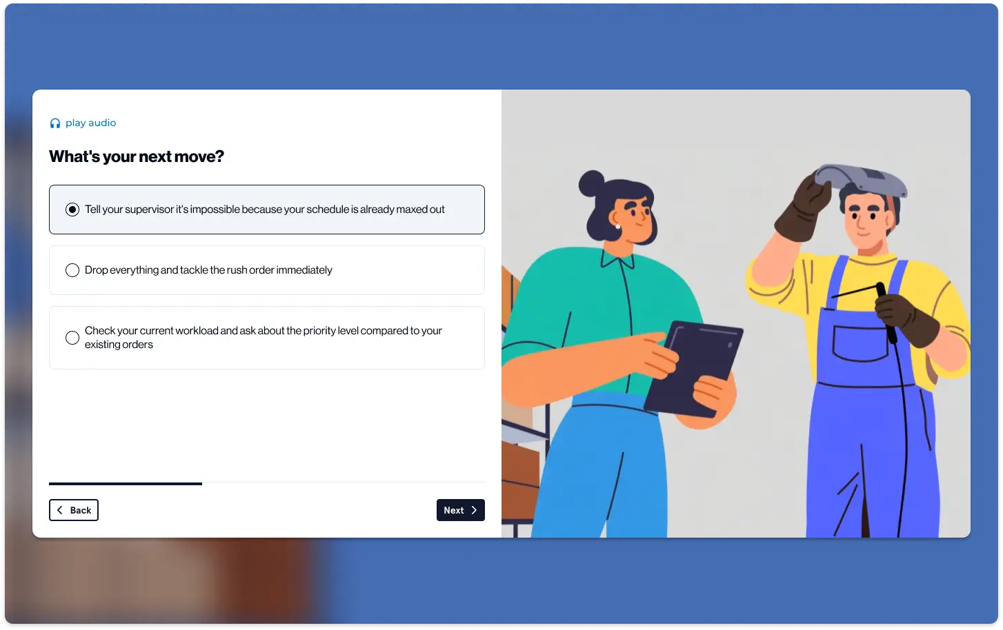
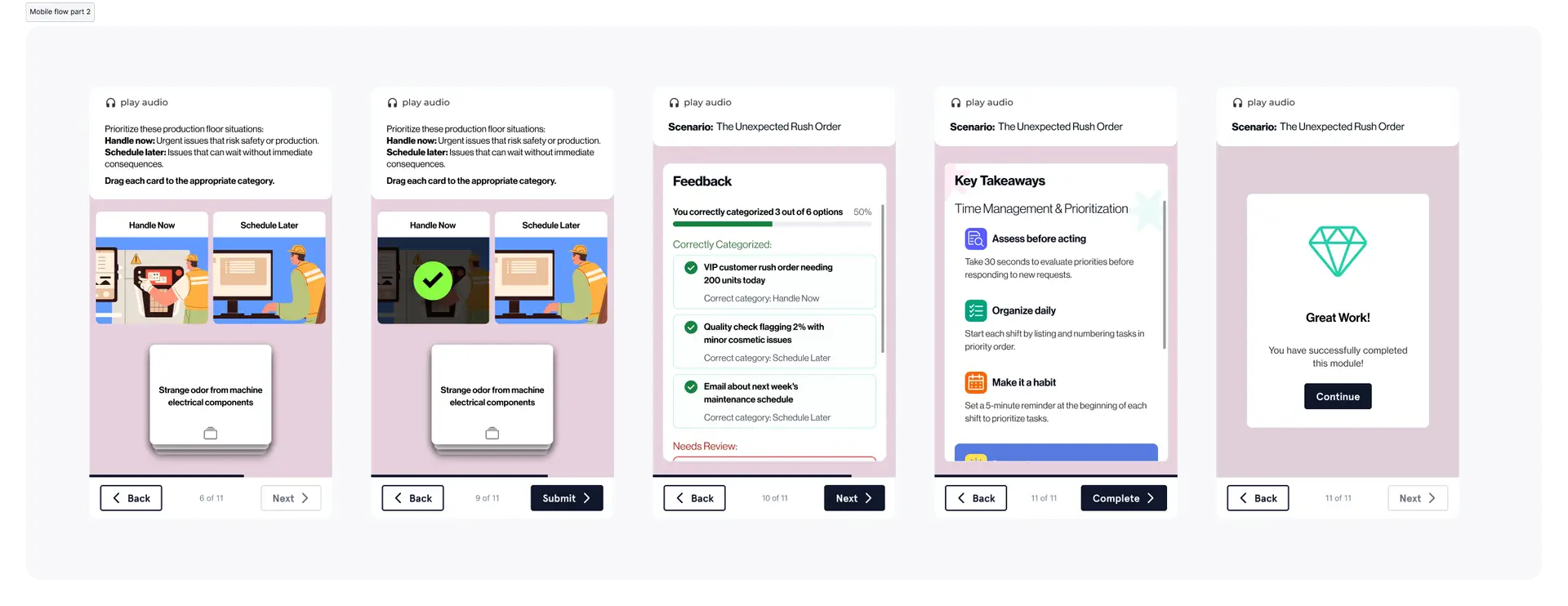
- Knowledge Check: Application-based questions (Sorting, Sequencing, or MCQ).
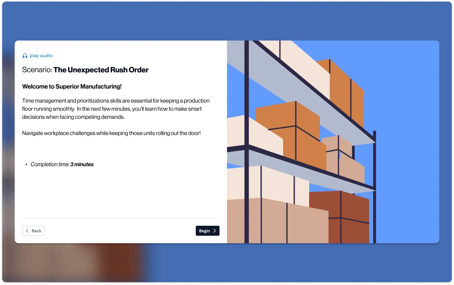
- OTJ Examples: Real-world scenarios across Retail, Healthcare, and Logistics.
- Reflection: Personalizing the information.
- Key Takeaways: Reinforcing essential points for long-term retention.
The Constraints: Design Discipline at Scale
Success in this project was measured by adherence to strict technical and content “Non-Negotiables.” I acted as the guardian of these standards during the UI phase:
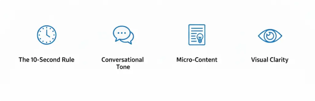
- Word Economy: A hard cap of 900 words per module to prevent cognitive overload on small screens.
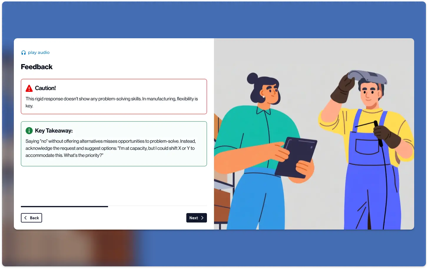
- Content Precision: Exactly 2 sentences per industry example, with the “Lesson Learned” in bold for instant scannability.
- Accessibility: All content maintained an 8th-grade reading level, ensuring the training was accessible to workers of all educational backgrounds and technical abilities.
Impact: Universal Application
By centering the design on Universal Workplace Language in the early screens and only branching into industry-specific examples in the middle, we created a system that feels “custom-made” for every worker while remaining highly efficient to produce.
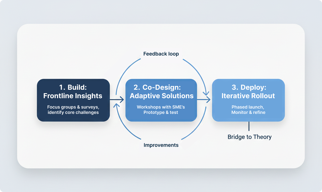
Iteration: Refining the Friction
Enhancing the Key Takeaways The final “Key Takeaways” screen underwent the most significant transformation. Initially, it served as a simple summary, but I redesigned it into a dynamic “Action Card” system. I leveraged the DLS modular components to ensure that the “Lesson Learned” was not just a sentence to be read, but a persistent tool the user could visualize in their actual workplace. By adhering to the 900-word limit and the two-sentence rule for examples, I stripped away the “corporate fluff” to focus on high-impact, actionable behaviors that empower employees to intervene in harassment situations.