Workplace Perspectives: Navigating Harassment
An interactive learning product designed to help users navigate workplace conflict through scenario-based decision-making. Focused on translating behavioural frameworks into practical, real-world interactions.
Who it’s for: Leadership & Business
Why this matters: Conflict is a constant in workplace environments, people struggle to apply frameworks under pressure. Learning often remains theoretical, breaking down under pressure. This project focuses on bridging that gap by turning behavioural concepts into practical, interactive experiences that support better decision-making in the moments that matter.
Overview
Role: Product / UX Designer
I led the design of the interaction model, scenario structure, and user flows, focusing on making behavioural frameworks actionable.
Timeline: March/April 2025
Tools: Figma, Skillsoft DLS (Design Language System)
Deliverables: High-fidelity Prototype (desktop & mobile), Interactive Learning Modules, Branching Scenarios, UI Kit
The Challenge & The Solution
The Problem: Users struggle to apply conflict management frameworks in real situations, especially under pressure. Existing learning tools are often too theoretical and fail to translate into practical behaviour.
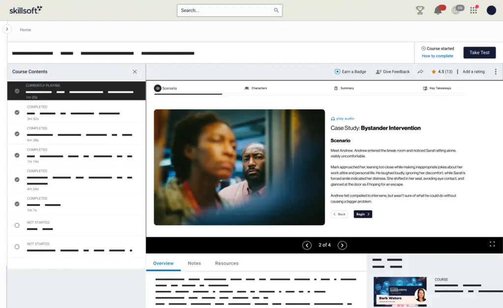
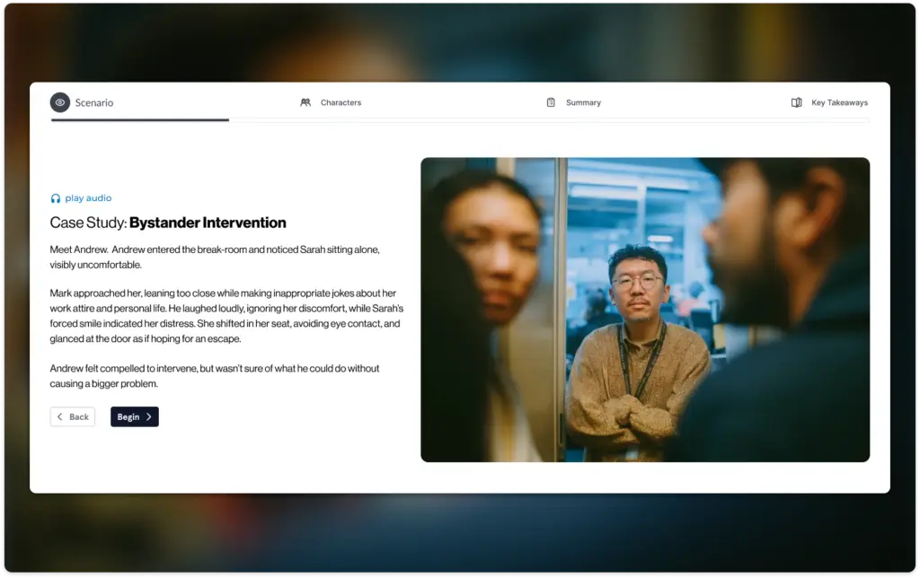
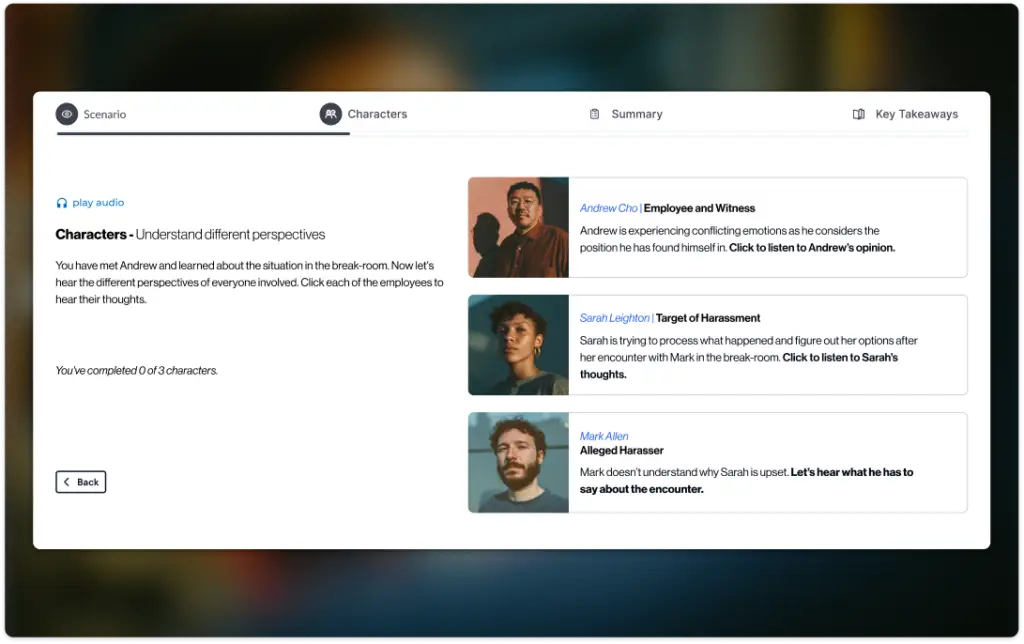
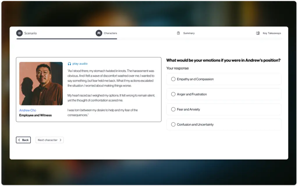
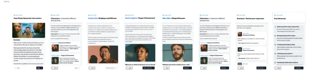
The Solution: Immersive Scenarios I implemented a “Practice-First” (Sequence B) methodology that allows users to experience a situation from different perspectives – the target, the observer, or the harraser. By simulating high-pressure interactions, the UI guides users through practicing safe, effective responses and understanding the profound impact of workplace behavior.
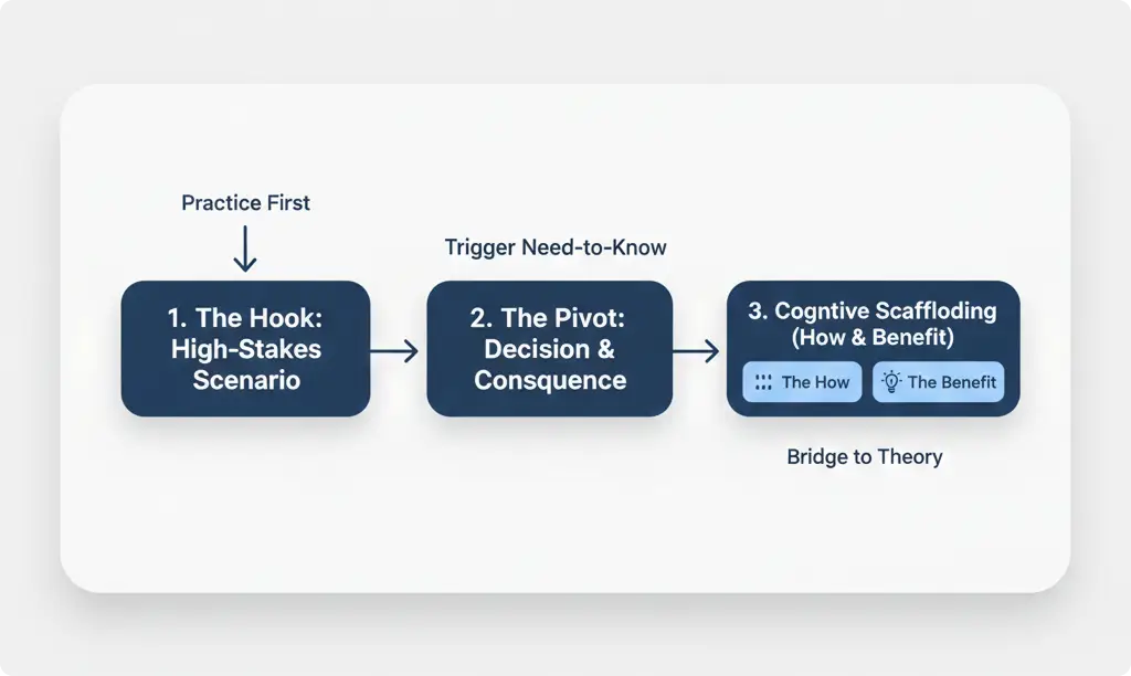
The Strategic Framework: Sequence B (Practice First)
To maximize engagement with a sensitive topic, I utilized Sequence B (Practice First → Framework), which is optimized for analytical and problem-solving skills.
- The Hook (Screen 1): Instead of an introduction, the user is immediately dropped into a realistic workplace scenario involving a subtle microaggression or harassment.
- The Pivot (Screen 2): After the user chooses a response, the app bridges to the “Skill Breakdown,” reframing the interaction through the lens of policy and empathy.
- Cognitive Scaffolding (Screen 3): I structured content to show “The How” (action steps) and “The Benefit” (workplace payoff) simultaneously to reinforce the value of immediate intervention.
- Explored open-ended simulations, but prioritised structured scenarios to reduce cognitive load and keep learning outcomes focused.
Design Principles: Empathy through Clarity
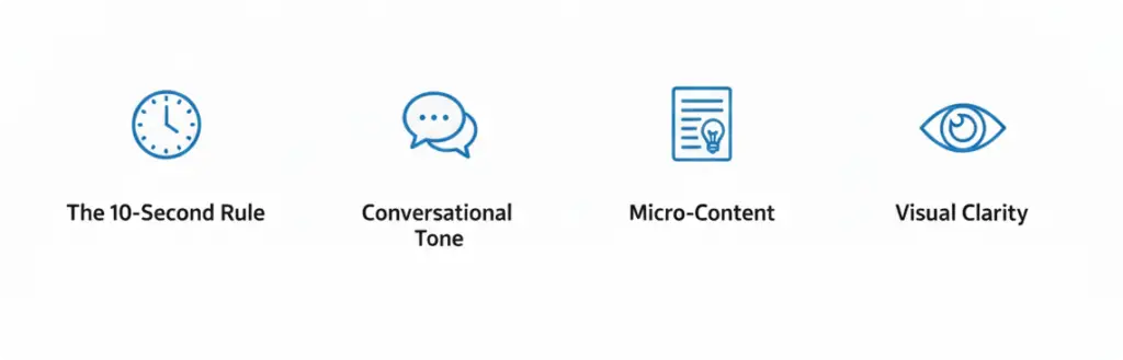
Designing for sensitive topics requires a balance of high-stakes tension and low-friction navigation. I followed strict standards to ensure the focus remained on the human story:
- The 10-Second Rule: Branching scenarios were designed for rapid decision-making, mirroring the pressure of real-world social interactions.
- Conversational Tone: I maintained an 8th-grade reading level with a trusted, “colleague-to-colleague” voice to reduce the clinical feel of HR training.
- Constraint-Driven Content: To prevent “information paralysis,” the entire module was capped at 900 words, ensuring every interaction was essential and impactful.
Scaling Impact: Universal Accessibility
A key requirement was ensuring these sensitive scenarios felt authentic across different corporate environments.
- Industry-Specific Examples (Screen 5): I designed modular “On-the-Job” components that featured exactly two sentences: the situation and a bolded Lesson Learned.
- The Result: A scalable framework that allows organizations to swap industry contexts while keeping the core psychological de-escalation strategies universal.
The Results:
Results are being monitored.
Iteration: Refining the Friction
Enhancing the Key Takeaways The final “Key Takeaways” screen underwent the most significant transformation. Initially, it served as a simple summary, but I redesigned it into a dynamic “Action Card” system. I leveraged the DLS modular components to ensure that the “Lesson Learned” was not just a sentence to be read, but a persistent tool the user could visualize in their actual workplace. By adhering to the 900-word limit and the two-sentence rule for examples, I stripped away the “corporate fluff” to focus on high-impact, actionable behaviors that empower employees to intervene in harassment situations.
Reflections: Experience over Instruction
This project reinforced my belief that interactive feedback is the most effective teacher. By designing for “safe failure”—allowing users to explore the consequences of an ineffective response—we created a deeper emotional understanding of workplace dynamics. It taught me how to use UX to facilitate difficult conversations and drive meaningful cultural change.